
Designers know to keep it simple, stupid, but how do you balance simplicity with complexity? We’ve always wanted to keep Strikingly simple, but we still need to support a wide range of options and customization to meet our users’ needs. It’s a tricky question, but there are some lessons in another corner of the web.
GD vs PE: The Browser Compatibility Battle
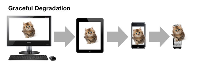
Let’s take a detour through a related problem: If you’re building a complex, media-rich website, how do you ensure accessiblity by older or mobile browsers? You may have heard of graceful degradation and progressive enhancement — two strategies to attack this problem. Graceful degradation (GD) starts with the rich version, then applies fallback rules for specific cases that don’t support all the detail. Progressive enhancement (PE) is the exact opposite — it starts with the most basic content first and layers on bells and whistles only if the browser supports it.
The concept of graceful degradation comes from the world of machinery. If your plane loses an engine mid-flight, it can still fly on the other engine — gracefully. If you manage a large assembly line and a single machine breaks down, you don’t want your whole factory to come grinding to a halt. So you might install a cheaper fallback machine nearby — a temporary slowdown is better than a complete stop. GD is designed to prevent catastrophe for mission-critical systems like airplanes and factories.
Now let’s visit the web design world of 2012. Graceful degradation was all the rage. The web industry had planted one foot in modern standards while the trailing foot was still stuck with legacy platforms. Nevertheless, ambitious web developers were giddy with excitement, since GD gave them permission to indulge in all the new features while treating backwards compatibility as an afterthought. CSS3, Animations, WebGL! Oh, we need to support IE8? Whatever, just toss in some fallbacks.
But we soon realized that new mobile browsers had all kinds of features missing, and IE8 was stubbornly sticking around. The hacky fallbacks kept piling on. The result? You’d open a link to a slick new interactive article, only to realize that it’s totally broken on your mobile browser. Eventually, the sugar rush died and devolved into yelling at the user to “just upgrade your browser.”
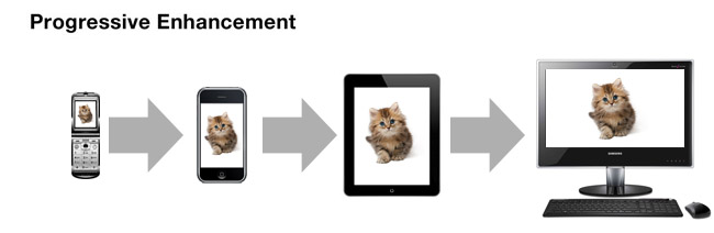
The problem didn’t go away, but a new strategy took hold. Progressive enhancement promised a return to the basics. Instead of building all the bells and whistles first and then adding a ton of messy fallbacks, web developers would start with the most barebones HTML/CSS, and only add ornamentation if the browser supported it. This strategy guaranteed that the core content of that slick new article would still be perfectly readable even if, say, your stock Android browser doesn’t support SVG animations. PE won out, and web developers breathed a sigh of relief.
So what’s the big deal?
But GD and PE are old news! It’s 2018 now! Smartphones run WebGL perfectly, IE8 is dead, end of story, right? Not so fast. Let’s dig into why PE won.
While both GD and PE attacked the same problem and arrived at the same result, they have a subtle but crucial difference of base case. In heavy industry, your base case should be maximum efficiency. Picture complex machines firing on all cylinders — any idleness is time and money wasted. GD still dominates the industrial world.
But for the web, it turns out that simplicity is the preferable base case. The web is made for humans, and humans care about core experiences — sometimes the bells and whistles are nice, but they can also be distracting. This reveals a powerful point: The core difference between graceful degradation and progressive enhancement is the difference between designing for machines and designing for humans.
You can find progressive enhancement in all kinds of people-centered products and services. Hotels and airlines have a straightforward basic service, but memberships for these services add a layer of complex features that only power users will opt into. Similarly, a car’s basic use case is getting from point A to point B, but enthusiasts can opt-in to a huge amount of complexity and customization — just ask Xzibit.
Progressive Enhancement for UX
The lessons of progressive enhancement are:
- Start with the basic core experience that’s guaranteed to work
- Add unnecessary-but-nice-to-have features only if they’re supported
- Make sure those features are independent and abstracted so they don’t break the core experience
This is exactly the same strategy for structuring UX in complex products. In Strikingly, the core experience is dead simple: Pick a template, edit some content, click publish, and you’re done. The complexity is also there, but it’s entirely optional, and these options never get in the way.
Note that in a product, a feature being “supported” does not mean browser support, but rather if it’s “supported” by the user — if the user understands it, wants it, or is ready for it.
Let’s look at some common design patterns for progressive enhancement.
1. Accordions & Drawers
A very simple way to opt-in to advanced content is to use an accordion or a slide-down drawer. Here’s one in Strikingly:
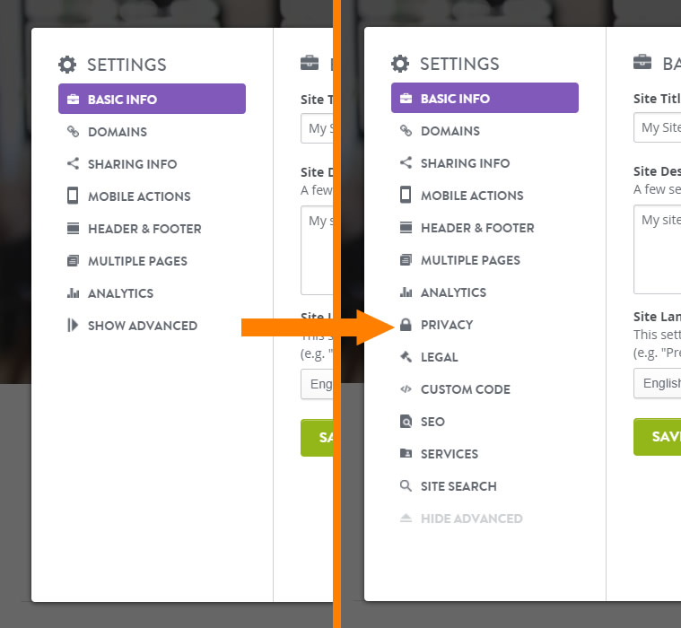
Hiding some items under the folded-up “Advanced” section means the entire dialog feels friendlier at first glance.
- How do you decide what functions go into “Advanced?” The important, non-optional settings like title and domain name stay out. The commonly-used functions like analytics also stay out. The less-frequently-used options go into the advanced section. You’ll need to observe your users’ behavior to determine how to split functionalities.
- The Advanced menu is helpful if there are many items. If we only had five items, we wouldn’t bother with an advanced section.
- The slide-down animation occurs in place, within the same dialog, instead of in a new screen. This minimizes the cost of learning new UI contexts.
2. Tooltips & Popovers

Tooltips are a small but clear example of progressive enhancement. In Reddit, tooltips are used to show a detailed timestamp. The base case “3 hours ago” is succinct, easy to read, and satisfies the vast majority of users. If the verbose timestamp were shown by default, it would be difficult to read and add a lot of visual clutter to each post. Instead, it’s only shown on mouseover — you get the full functionality without hurting the core experience.
The screenshot above is a native tooltip (using the title HTML attribute), but you can also use “hard” tooltips like this. Tooltips can be used to display all kinds of non-core content.
3. Smart Defaults
If you’re building a complex form, set pre-filled defaults that cover the lowest-common-denominator use case. A common UX in any ecommerce checkout flow is the ability to check “Use same address as shipping info” for the billing info. An entire address form is several input boxes long, so it saves a lot of time to auto-fill it.
4. User Levels
Games use progressive enhancement constantly to restrict access to advanced features as well as entice players to play more. This is especially important for mobile games, which must deliver an amazingly simple core experience within the first several seconds of gameplay. The most basic implementation is a level system where features are unlocked as the player progresses (becomes “ready” to handle the new feature).

In FarmVille 2, the “Co-op” feature is only unlocked when the user hits Level 11. Co-op farms are certainly more advanced since they require managing relationships with other players, which often comes with delays and uncertainty. You can imagine how lost and confused players would be if this feature were available from the very beginning.
5. Power-User Mode
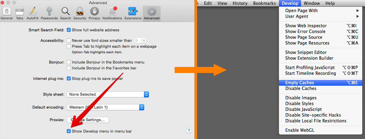
For a more aggressive ramp-up in complexity, you can force users to activate an entirely new power mode for your app. In desktop Safari, for instance, you can’t access developer tools until you click this checkbox deep in the advanced browser options. But after you do, the full power is available right from the top menu bar.
Another example of a power mode is in advanced desktop applications with fully customizable UI. Photoshop, for example, has dozens of different editing panels available in the “Window” menu. There’s no way users can see or use all these at once, so Photoshop lets you craft which “mode” you want to use.
The above examples are just a small sampling of progressive enhancement techniques. There are hundreds more, big and small, and they all follow the pattern of a simple base experience plus an unlockable advanced experience.
The Problem of Discoverability
The main downside of progressive enhancement in UX is discoverability. In effect, PE is about finding clever ways to hide complexity by putting up certain barriers. But the barrier cannot be too high. If you deem a certain feature as advanced but the user thinks it’s core and necessary, they might have a tough time finding where you’ve hidden it.
This means you’ll have to be careful in pinpointing exactly how advanced a feature is. And as shown above, there are many different ways to hide a feature, with varying degrees of discoverability. Organization and hierarchy are also critical to point users in the right direction to discover advanced features.
Progressively Enhancing Humanity
| Graceful Degradation | Progressive Enhancement |
|---|---|
| Engineer’s mindset | Designer’s mindset |
| Optimized for machines | Optimized for humans |
| Full complex solution as base case | Simple core as base case |
| Fallbacks layered underneath the base case | Complexity layered on top of the base case |
Much of the conflict between designers and developers comes from the different mindset between GD and PE. Both are needed to build a great product. Designers should appreciate engineers’ desire for technical completeness and for reducing failure rates, while engineers should respect designers’ focus on simple base cases to create better experiences.
As a designer, it’s not enough to fill your toolkit with a bunch of UI components. It’s far more important to understand the fundamental principles of user experience, so you know when and why to apply each component. Now you should be able to pick out all sorts of cases of progressive enhancement in products all around you. Keep it simple, but don’t be afraid to wrangle complexity.